Introduction
Clearwater County’s brand is portrayed through use of images, signage and our logo. All of these communication tools work together to create Clearwater County’s graphic identity.
It is essential for the success of the County to ensure this graphic identity is consistent. The following manual will show you some do’s and don’ts in regards to various visual pieces such as the logo, letterhead or typefaces.
The goal of a consistent visual identity is for the public to immediately recognize Clearwater County when they see our website, a business card, online ad, or even an envelope. Therefore we need to have a unified look and feel, which includes establishing a standard set of colours, fonts, image treatment, etc.
Purpose Statement
Through proactive municipal leadership and regional partnerships, we will invest innovatively to generate and support economic and population growth that positions Clearwater County for a sustainable, prosperous future.
Vision Statement
Our communities are connected by our appreciation for, and stewardship of, our natural beauty, our economic prosperity, our quality living, and the diversity of our wonderful people.
How We Want To Appear
This brand identity manual is intended for use by Clearwater County staff and business partners, as a way to maintain the corporate signature and visual identity of Clearwater County. Inside you will find illustrated and written rules for the use of logos, typefaces and other visual representations of Clearwater County. No matter what graphic is being used it is important this manual is consulted before and after its creation. The brand identity manual ensures all County communications are consistent and professional. Should you have any questions regarding the logo or brand, please contact the Communications Coordinator at communication@clearwatercounty.ca.
Logo
Our logo is one of our strongest communication tools. It is recognizable, simple, eye catching and represents who we are without words.
Clearwater County’s logo can be used in a variety of situations. It already has a strong identity for the County and we want to continue to promote who we are with it.
Download LogoLogo Overview
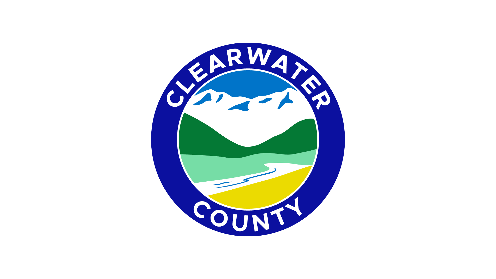
Primary Logo
The primary logo should be used whenever possible. The preferred usage of this logo is on a white background.
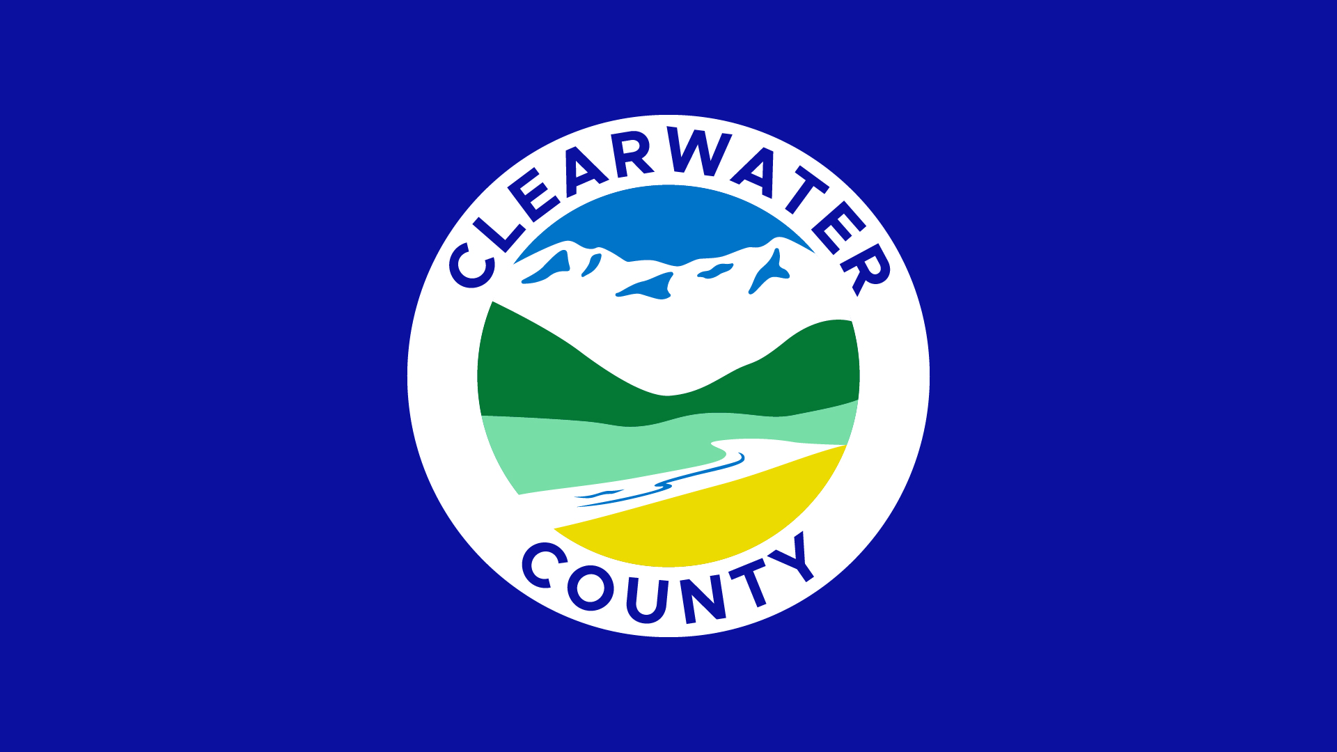
Primary Logo Reversed
Reversed format to be used on Ultra Marine Blue background.
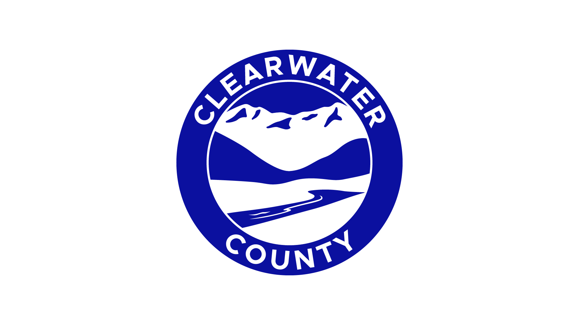
Primary Logo Single Colour
Single colour format to be used on white background.
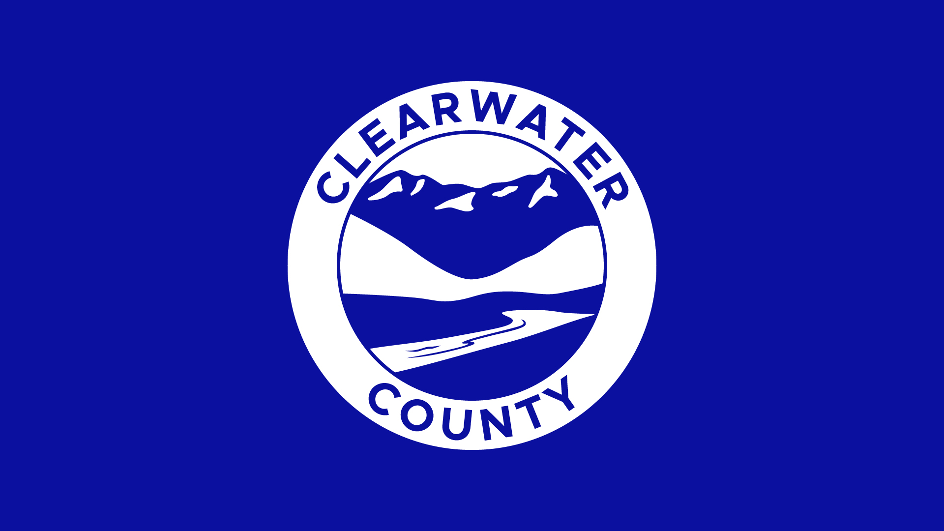
Primary Logo Single Colour Reversed
Reversed single colour format to be used on Ultra Marine Blue background.
Secondary Logo
Use the Secondary version on light backgrounds (preferably white) where available space favors extended sizing. This secondary alternate version of the logo can be used, depending on format needs and logo size, for purposes of legibility and flexibility. This logo version will follow all of the same rules as the primary version.
Secondary Logo Reversed
Reversed single colour format to be used on Ultra Marine Blue background.
Minimum Size & Clear Space
In order to maintain the integrity of the logo, a minimum size has been established which must be applied to the logo when required. Use discretion when decreasing the size of the logo and when being used in relation to other design elements.
The minimum width of the logo is roughly the size of a loonie, however for smaller design requirements use of the alternate secondary horizontal logo is recommended. For advice on logo size and usage contact the Communications team.
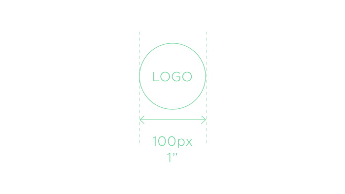
The logo should never be smaller than 100px wide (digital) or 1†(print).
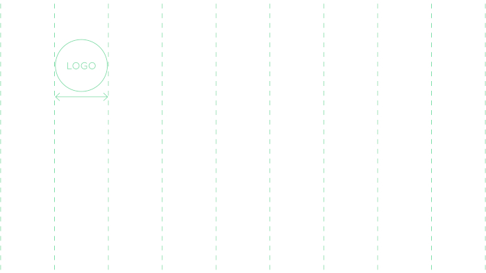
The size of the logo for horizontal/landscape orientation should never be less than 10% of the width of the total canvas.
A 16:9 slide with a canvas of 1920px x 1080px. Divide the width by 10 and this is the minimum size the logo should be (1920/10= 192px).
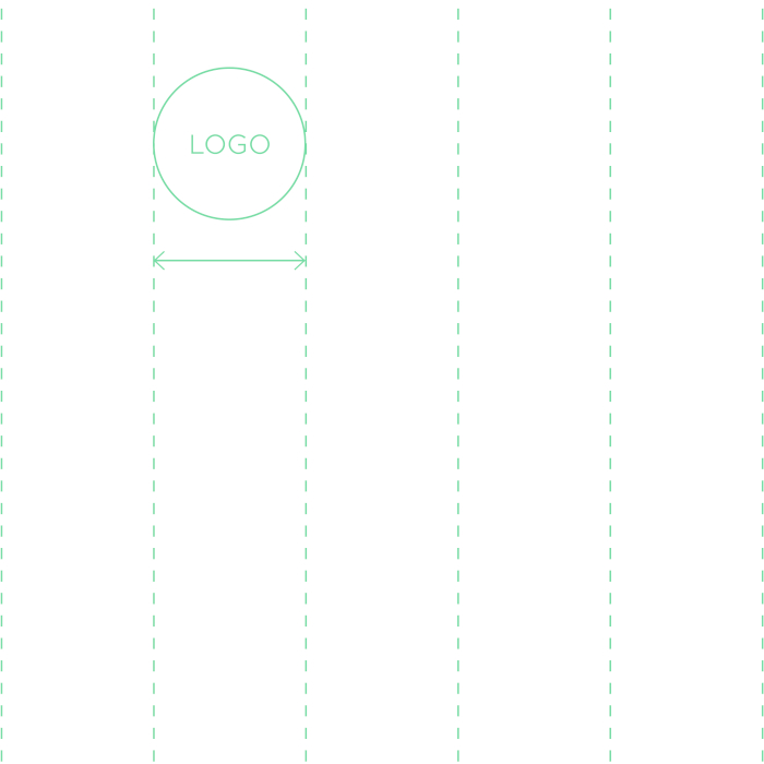
The size of the logo for square or vertical/portrait orientation should never be less than 20% of the width of the total canvas.
A social post with a canvas of 1080 x 1080px. Divide the width by 5 and this is the minimum size the logo should be (1080/5= 216px).
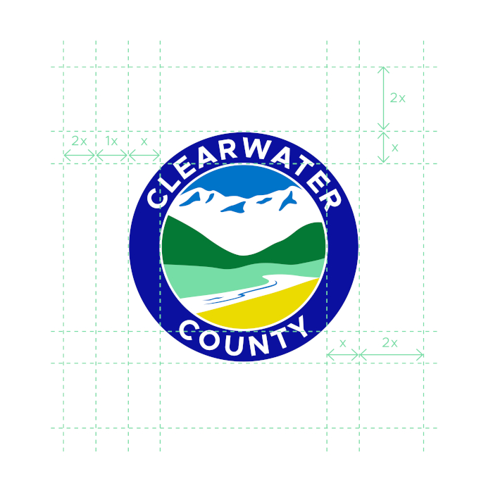
In order to create maximum impact, it is important to keep the space around the logo free from other text and graphics. This buffer zone around the logo ensures prominence, integrity and professionalism.
Clear space around the logo is equal to 2x the width of the ring border.
Placement with Partner Logos
There are many instances when the County logo will have to appear with other partner logos. If there is a choice in arrangement, the preferred position for the County logo is the ‘anchoring’ position either at the beginning or at the end of the line of logos.

The surface area (or visible volume) of the County logo should be approximately the same as the area of each of the companion logos –unless the County is the lead partner, in which case the County logo will be larger.
Partner logos should be spaced at approximately half a County logo-width from the County logo and from each other as shown.
Minimum size for the County logo appearing with partner logos is also shown.
Incorrect Usage
The logo is extremely valuable property and should be treated as such. In no instances may it be altered or tampered with. By controlling the background in which the logo is placed, legibility and maximum impact are assured.
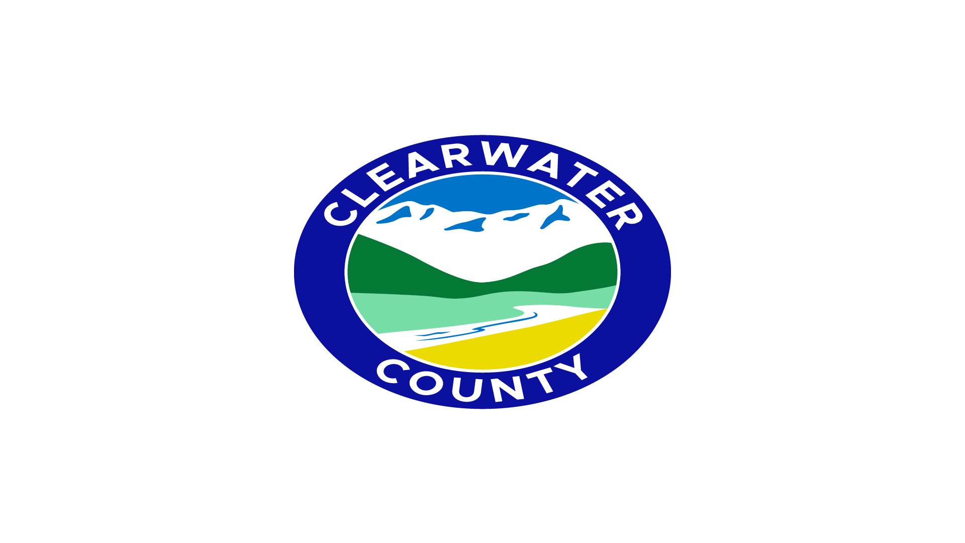
Never stretch, skew or distort the proportions of the logo.
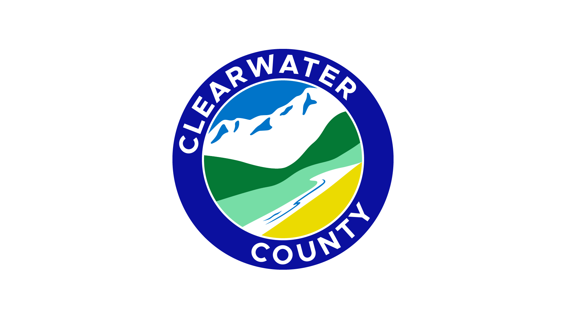
Never tilt or rotate the logo.
Never add effects such as drop shadows, embossing, etc.
Never adjust the opacity of the logo.
Never use the primary logo on the same colour as the logo colours
Never use backgrounds that are overly busy or too dark that it diminishes the clean look of the logo.
Never alter the logo colours of any part of the logo.
Colours
Our primary brand colours are Ultra Marine Blue, Pine Green and Citrine. They are used to provide accessibility, simplicity, and consistency throughout all brand communications.
French Blue and Burmuda, can be used as accent colours for call-to-action buttons or add shading to illustrated accents and icons.
Primary Colours
Ultramarine
HEX
0B109F
RGB
11, 16, 159
CMYK
100, 84, 0, 0
Pantone
072 C
Pine Green
HEX
047835
RGB
4, 120, 53
CMYK
99, 24, 96, 10
Pantone
356 C
Citrine
HEX
ECDB00
RGB
236, 219, 0
CMYK
2, 13, 99, 0
Pantone
3965 C
Secondary Colours
French Blue and Burmuda, can be used as accent colours for call-to-action buttons or add shading to illustrated accents and icons.
French Blue
HEX
0074C8
RGB
0, 116, 200
CMYK
100, 40, 1, 0
Pantone
3005 C
Burmuda
HEX
77DDA7
RGB
119, 221, 167
CMYK
60, 0, 48, 0
Pantone
353 C
Type
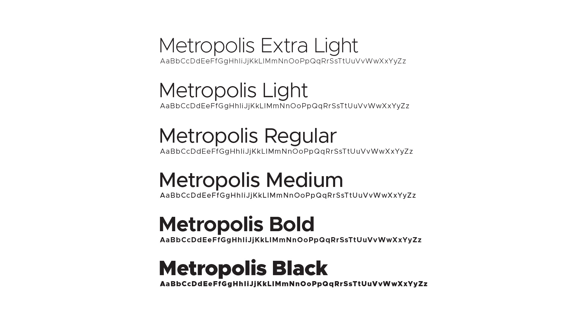
Our font is modern, approachable, clean and designed to maximize its impact across all applications while maintaining legibility.
The Metropolis font family has wide versatility that allows us to use this single typeface for all branded assets by leveraging various sizes and weights to communicate hierarchy and areas of importance.
Metropolis
Hierarchy & Pairings
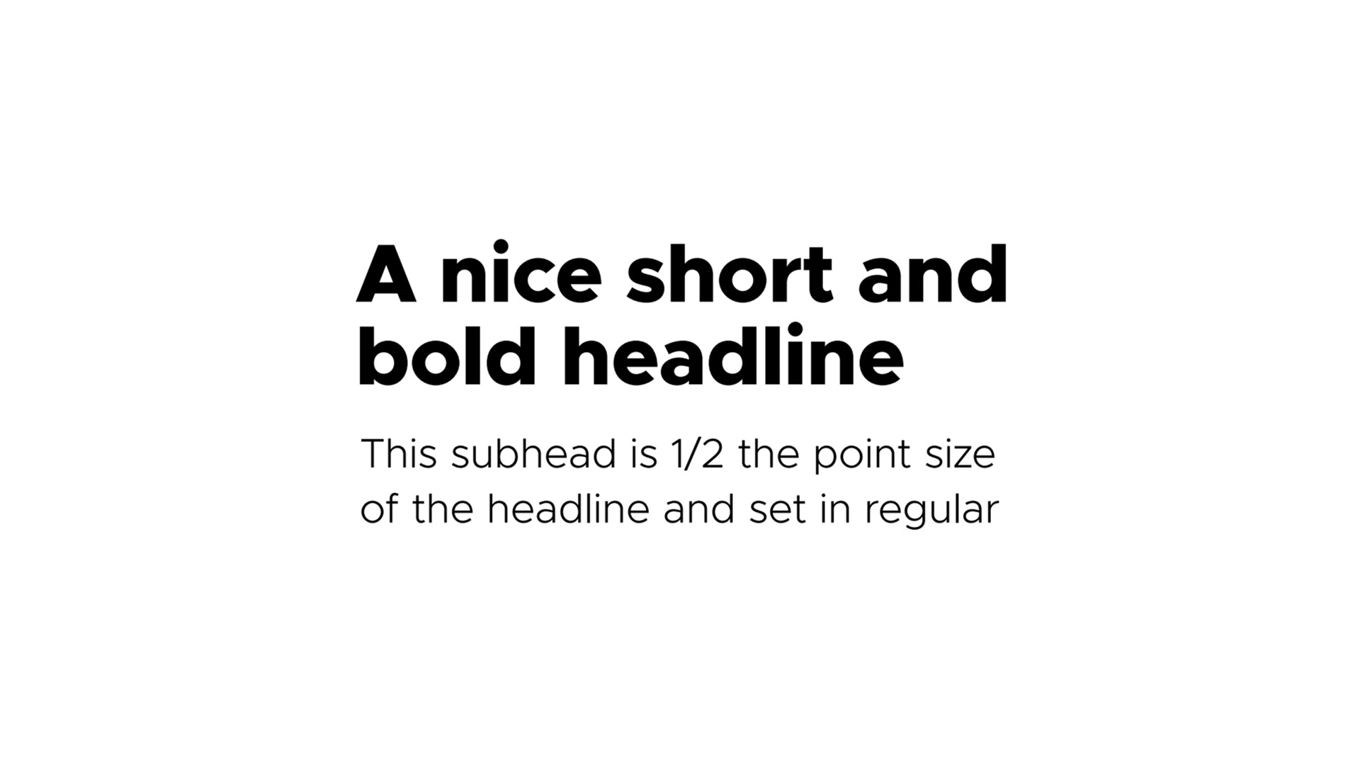
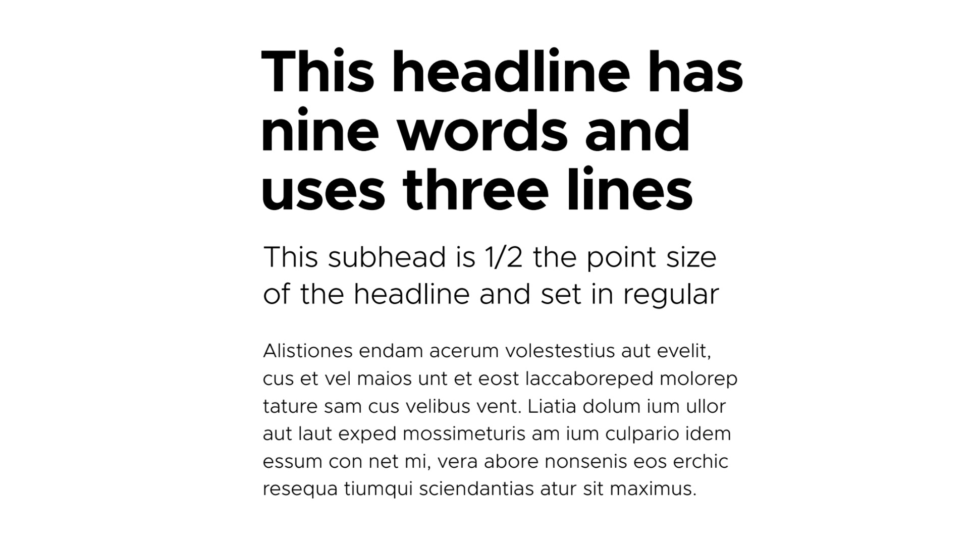
It is important to maintain these types of pairings to allow for clarity, consistency, and a strong hierarchy for all communications. For headlines and sub-headings, Black weight should be paired with Regular weight, and Bold weight should be paired with Light weight. Body text should always be Light weight.
Headline
Metropolis Extra Bold
1.0/100% leading
-10 tracking
6 words or less
Subhead
Metropolis Light
½ headline point size
1.25/125% leading
0 tracking
Headline
Metropolis Extra Bold
1.0/100% leading
-10 tracking
6 words or less
Subhead
Metropolis Light
½ headline point size
1.25/125% leading
0 tracking
Body Copy
Metropolis Light
â…“ headline point size
1.4/140% leading
0 tracking
Design Element
This stroked version of the internal graphic portion of the Clearwater County logo is an additional graphic element for brand collateralfor brand collateral use only. This cannot be used as a stand alone logo. It is used as an ultra-oversized visual on backgrounds, running out of bounds, never showing the full design.
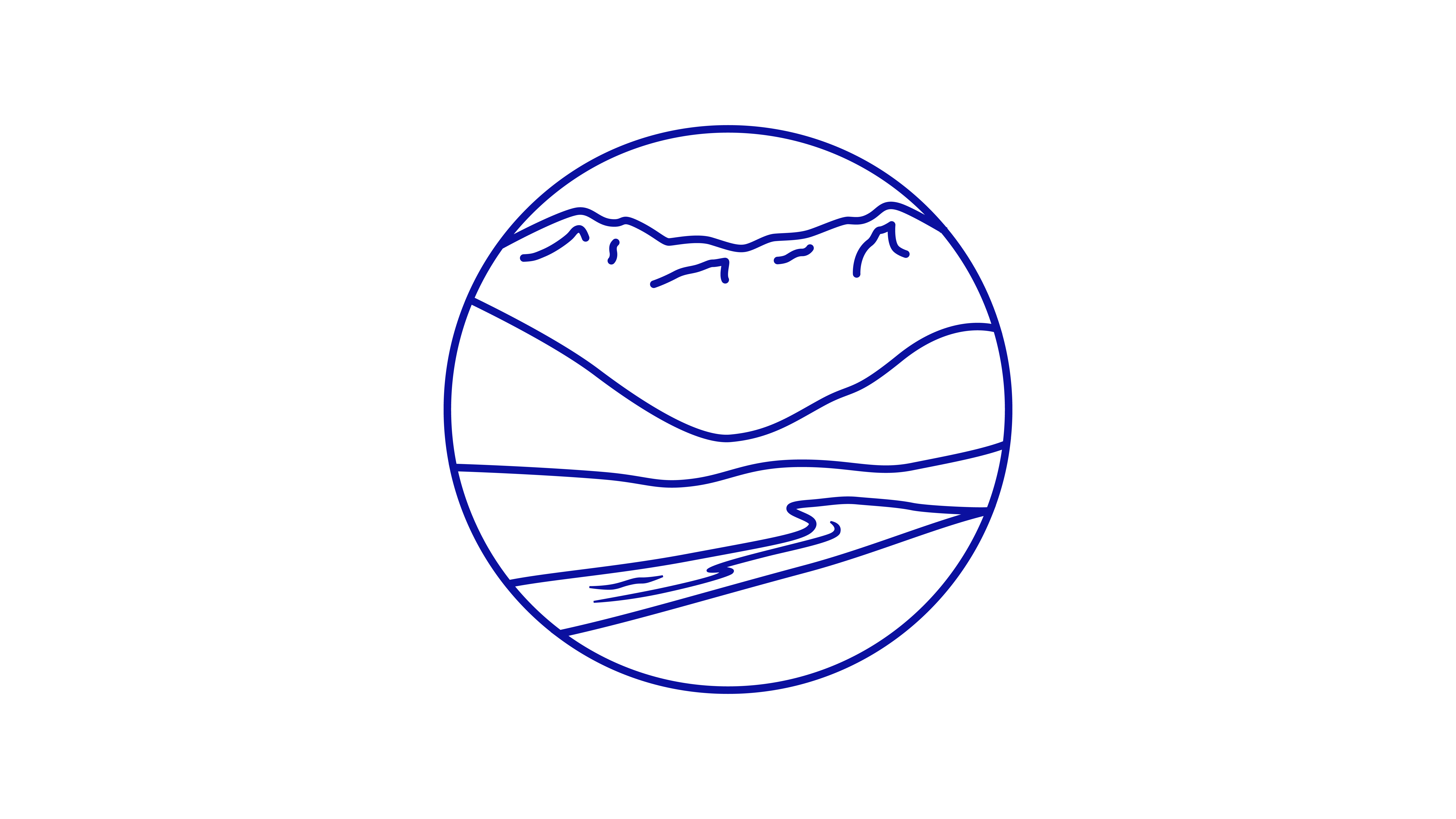

On white – Use original/Ultra Marine Blue version at 10% tint of full colour.

On Ultra Marine Blue pantone colour background – Use reversed/white version, set to ‘Screen 60% opacity’.
Brand Applications
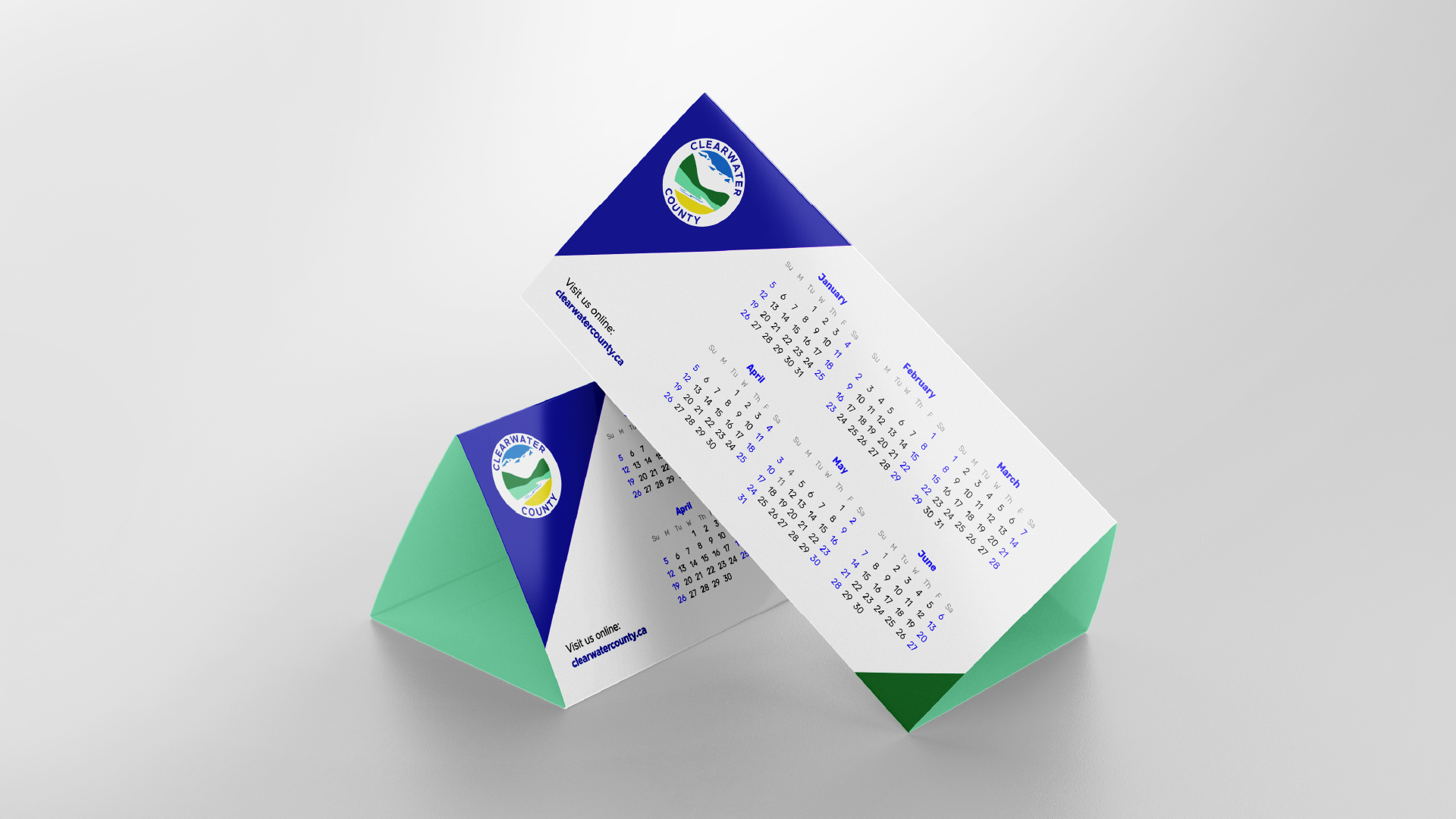
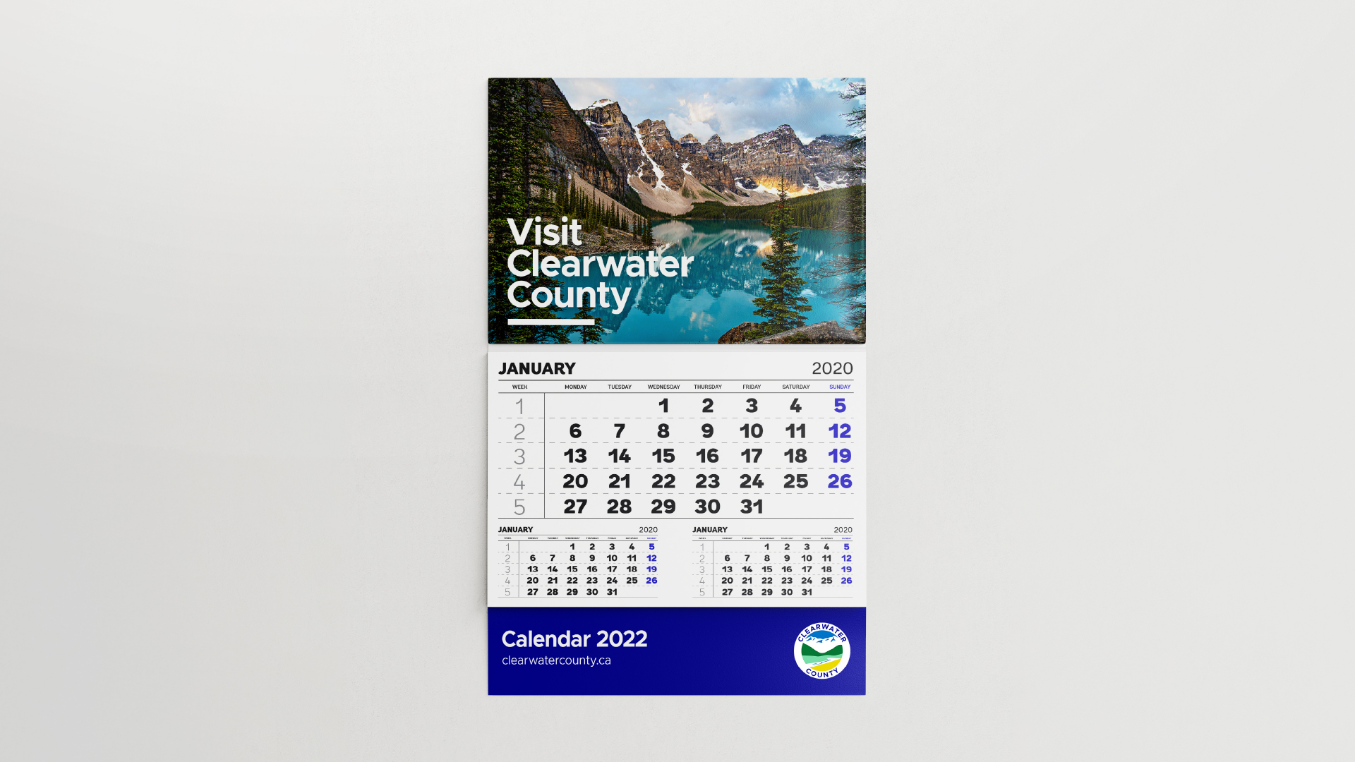
Print Materials
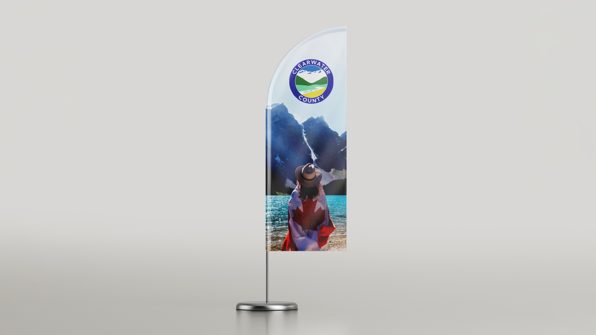
Signage
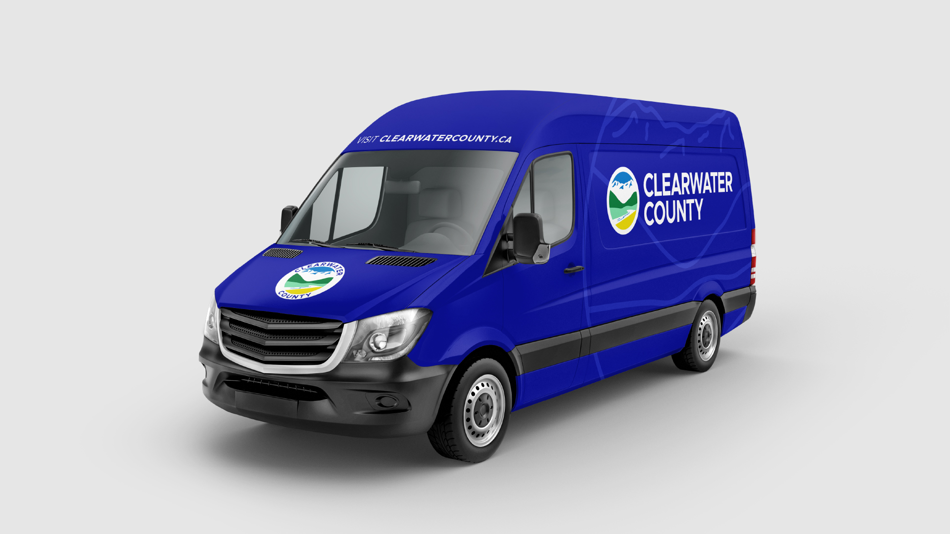
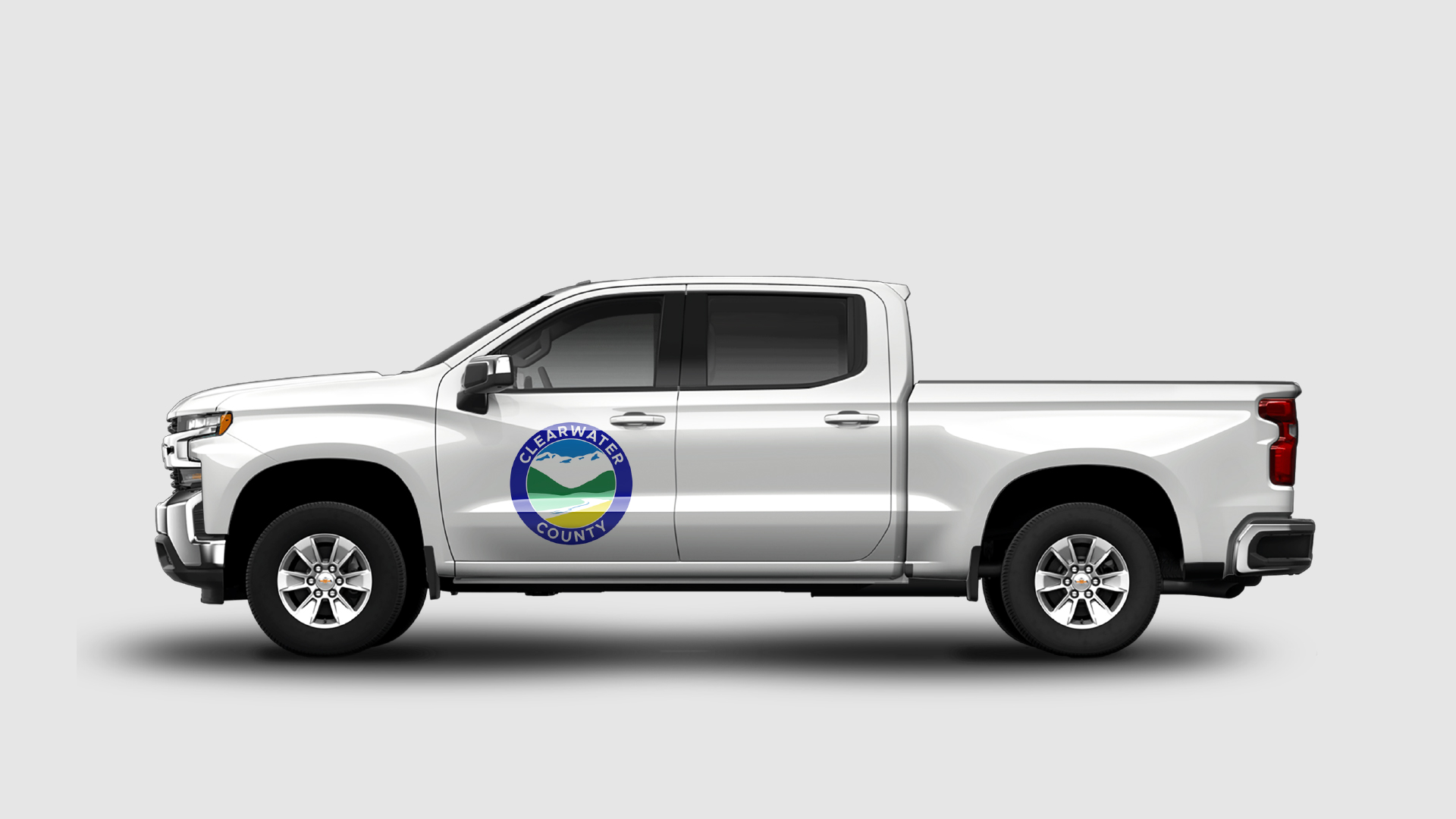
Vehicle Decals
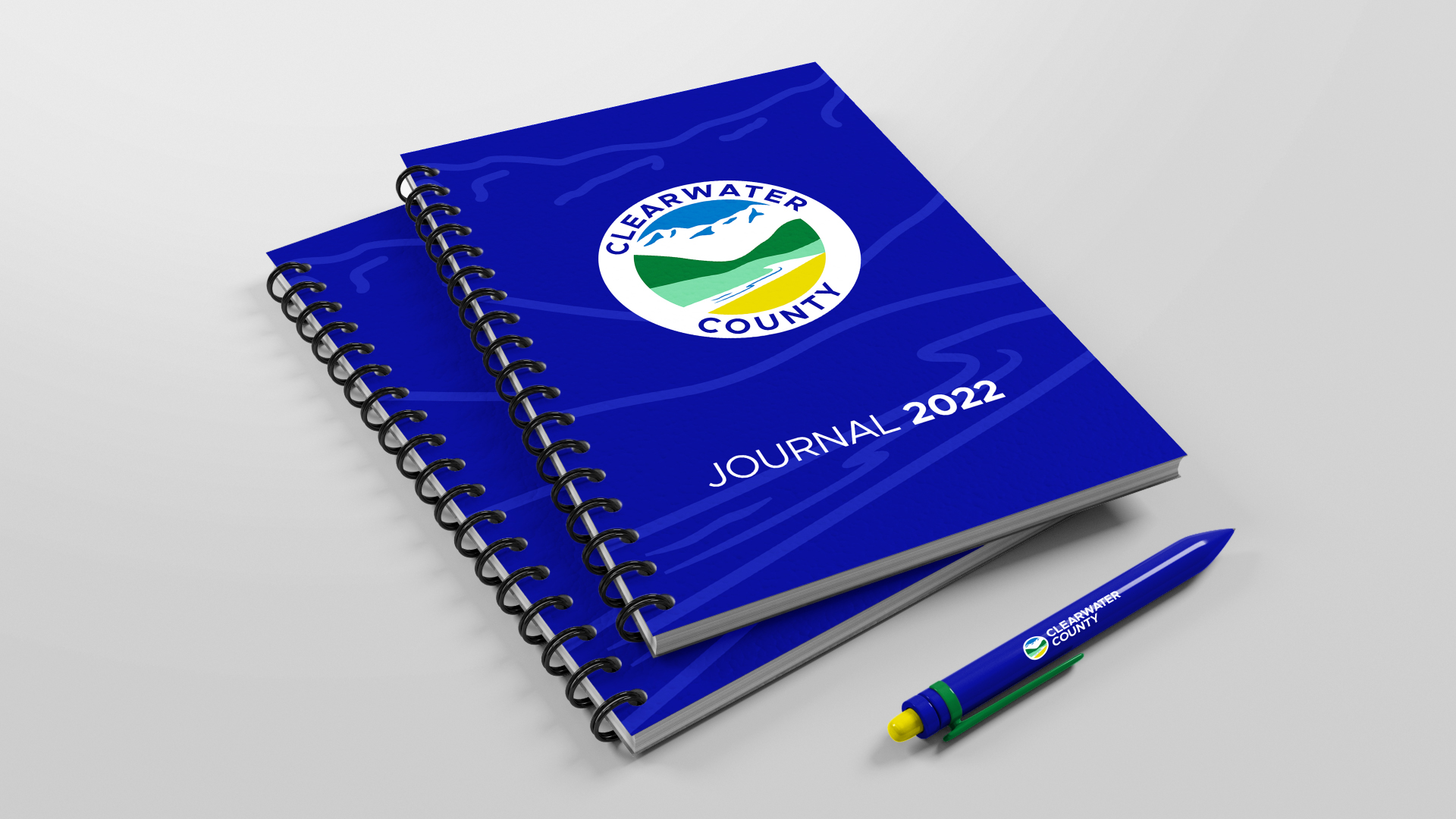
Stationery
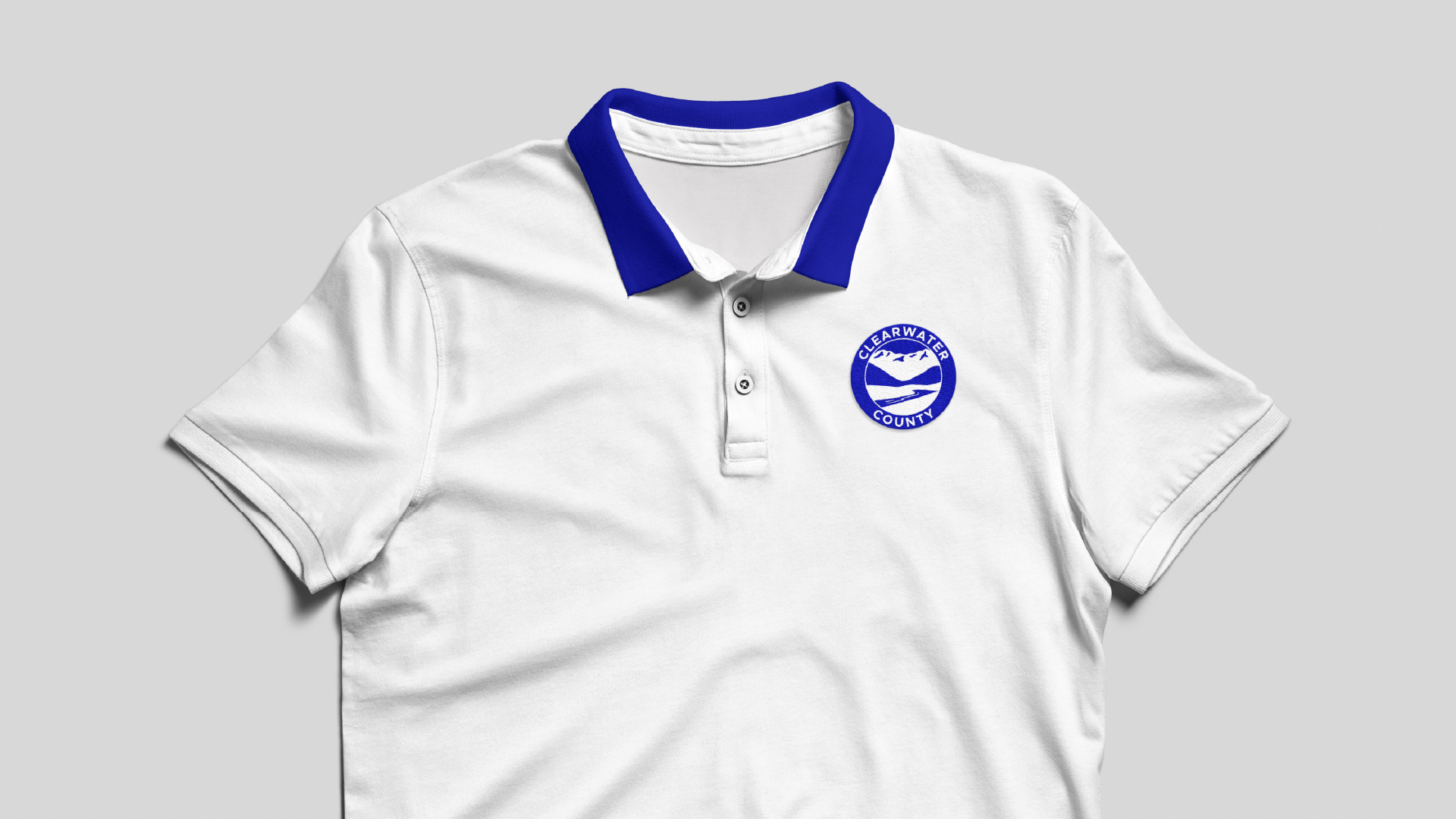
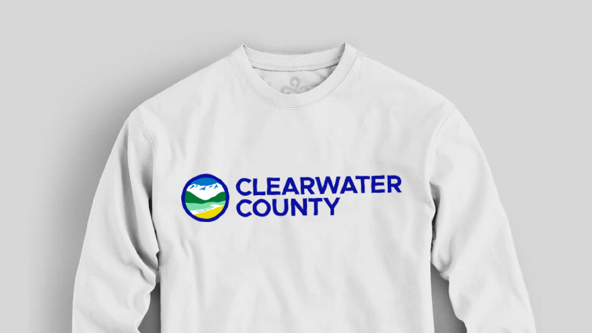
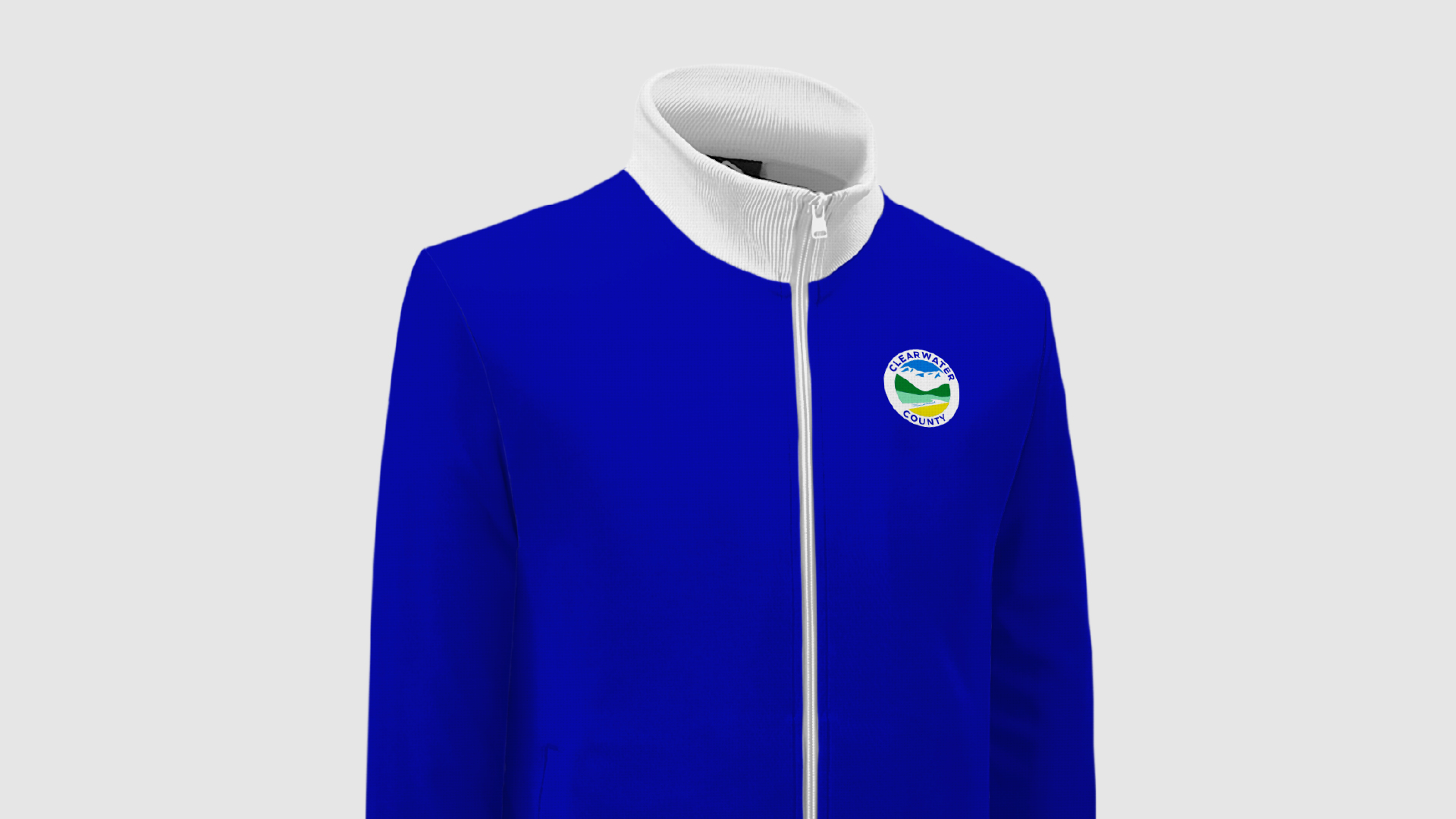
Wearables
Promotional Products
